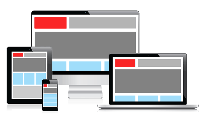
Users experience websites on a variety of devices and screens including smartphone, tablet and TV and they expect a good browsing experience on whichever device they happen to be using. So it is crucial that you consider mobile in your overall web strategy.
As a multi device digital agency, we focus on optimizing our client’s websites for multiple screens and devices to increase engagement from customers.
Responsive design usually means serving the same content on a single URL and builds on the idea of 'one web'.
For the majority of clients a responsive website is the ideal solution for a multi device world. However if the requirements of the mobile users are significantly different to those of a desktop users an Adaptive Mobile website or an App might be more appropriate.